If app Case 2 of 4
Creation, improvements and redesign of If self service apps
Policies, claims and invoices in native apps for different countries. I designed them end to end: new features, validation, data and feedback analysis, and a branded native redesign on a shared component library.
In short
The If app does what our web self service does, faster and native: policies, claims and invoices.
When I took it over, it worked, but every release made it look a little older. I designed new features, validated them with users, used data and feedback to decide what to fix first, and redesigned it as a branded native app in SwiftUI and Material Design.
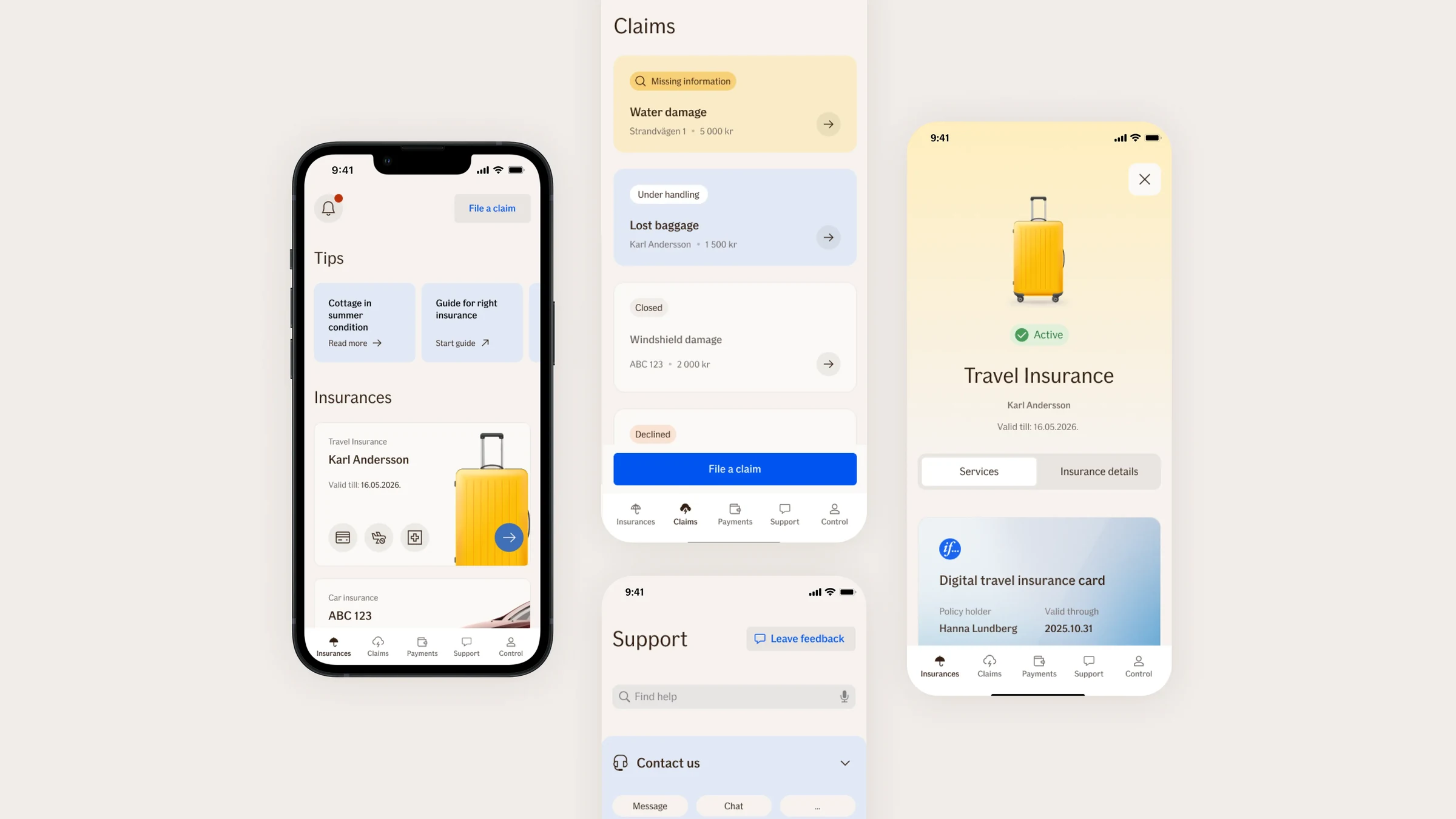
Before and after
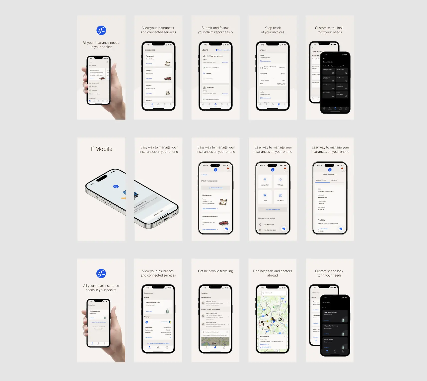
Same tasks, a new app: a structure built around how people look for things, and one colour and component system on iOS and Android.
Goal
An app that feels native on both platforms and handles the common tasks without the website.
Success metrics
- App Store and Google Play ratings
- Monthly active users
- Completion of key tasks
- Claims reported in the app
- Adoption of new features
- Support contacts about the app
My role
I owned the app’s design end to end, working with POs, business developers, engineers, QA, analysts and a scrum master across the Nordics and the Baltics.
Discovery
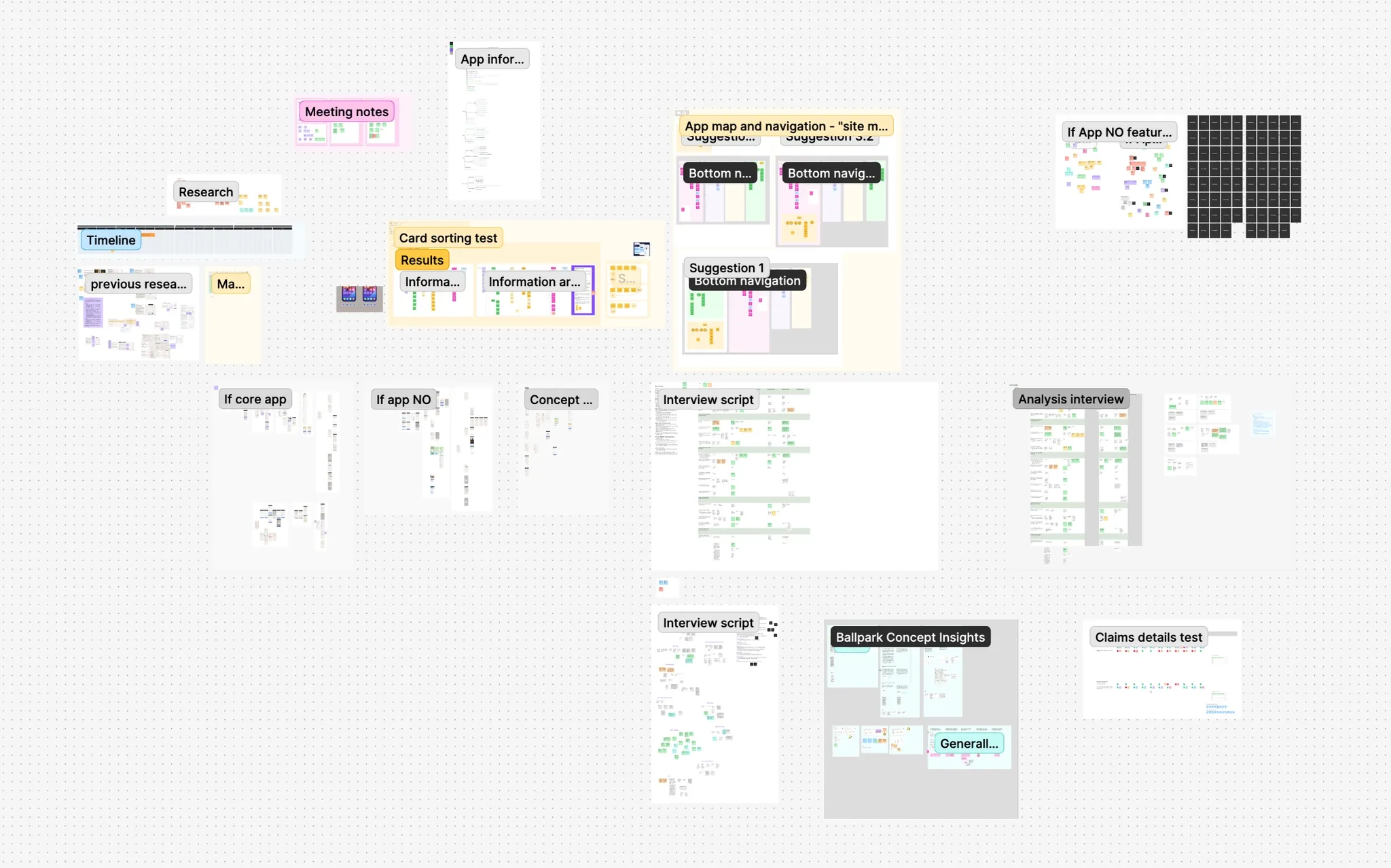
Customer feedback and app data showed what to fix first. Interviews, user flows and card sorting showed how people actually look for things.
Workshops
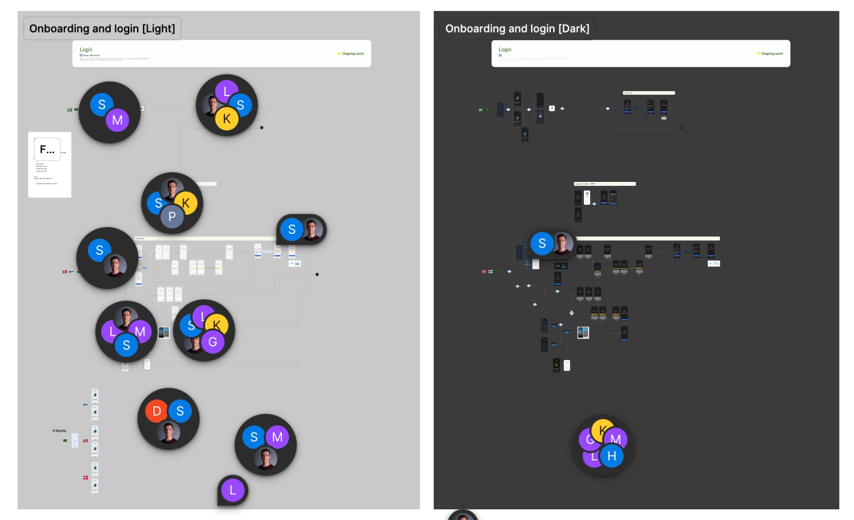
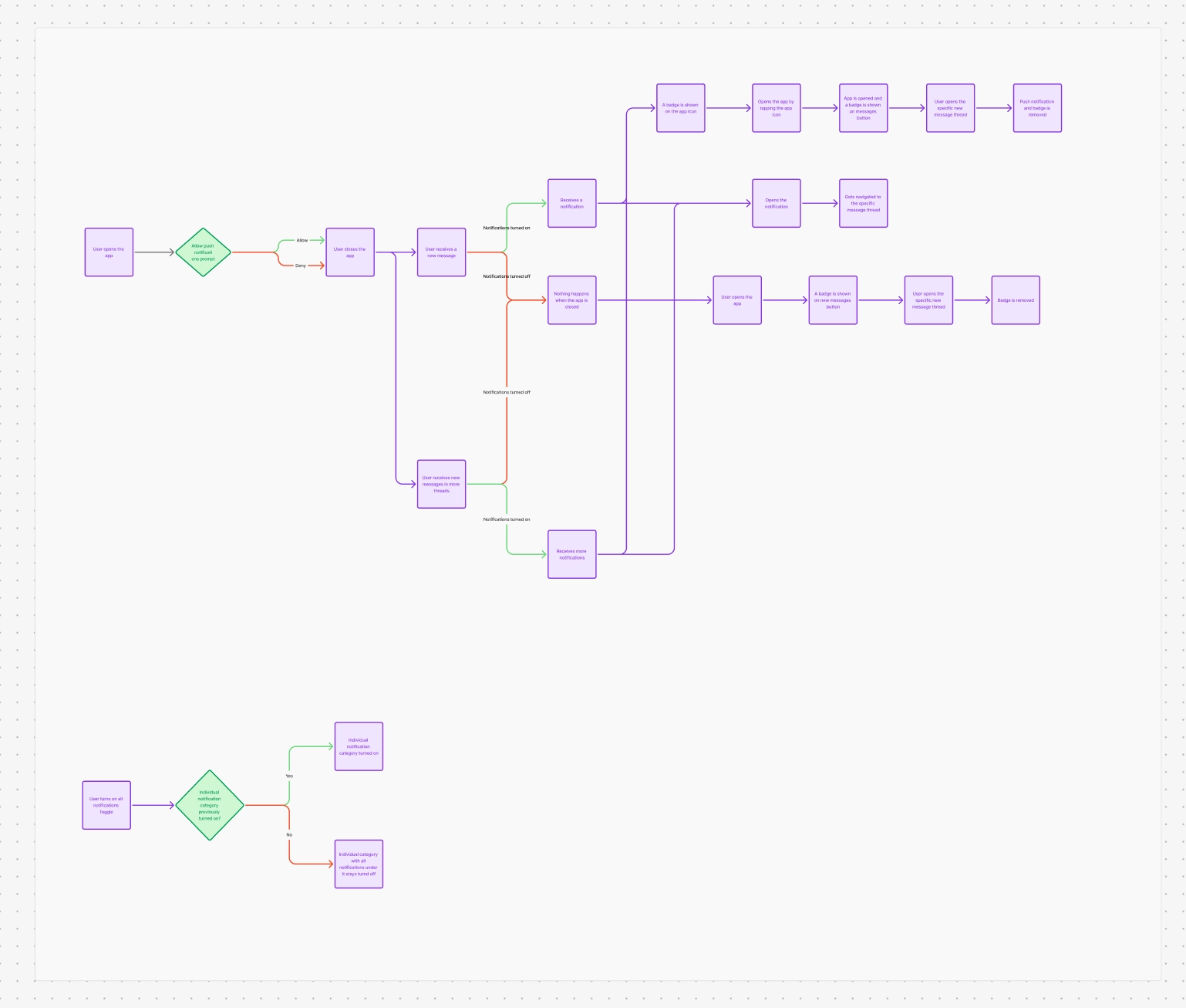
The major flows were worked through in the open, with specialists from across the company.
Decisions that shaped it
Fix and redesign at the same time
Customers didn’t wait a year for fixes, and every fix taught us something the redesign could use.
Structure before screens
The app was reorganised around how people look for things. The common tasks are one tap away: insurances, claims, payments and support.
Validate first, then measure
New features were tested as prototypes before development, and app data and feedback after release showed what to improve next.
Treat sensitive changes as sensitive
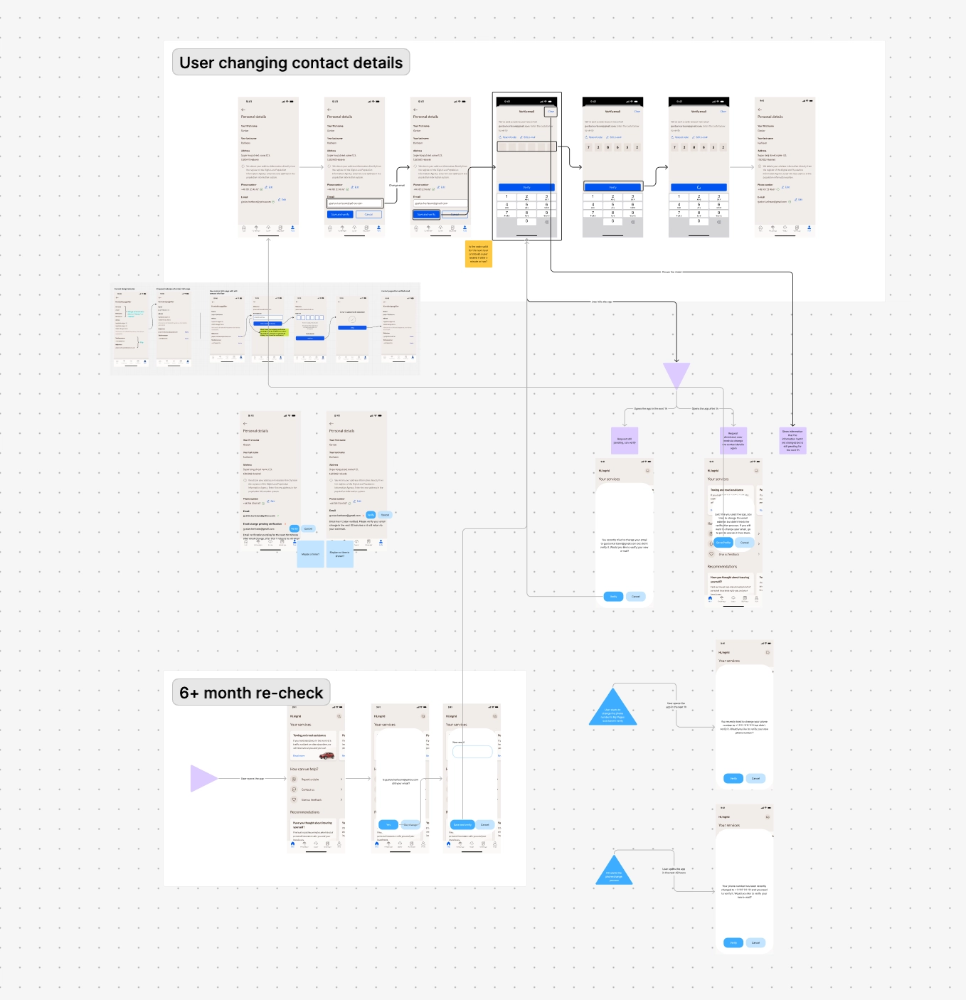
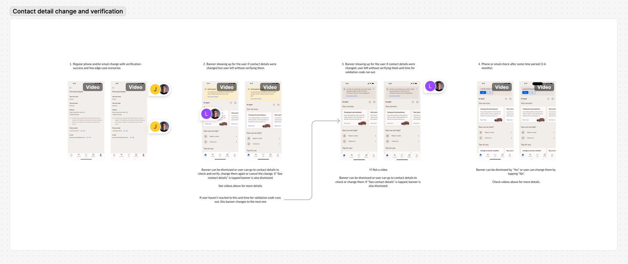
Changing contact details is a classic account takeover route. Every change is verified, with a re-check after six months: quick for the owner, hard for anyone else.
Design reviews
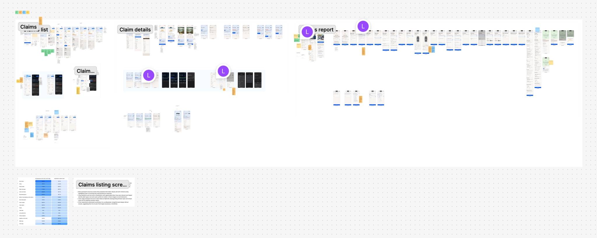
Every flow went through reviews with the developers who would build it.
One system for every app
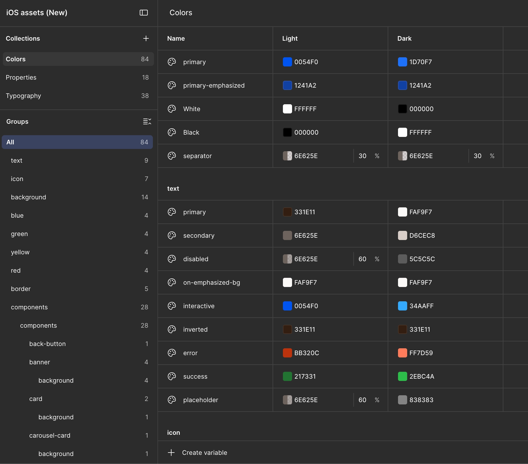
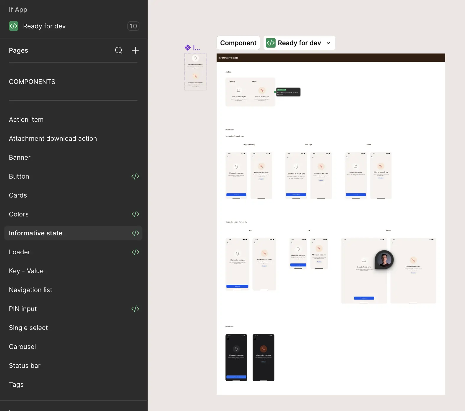
Colour variables and a component library in Figma, shared by designers and developers, built natively in SwiftUI and Material Design with the If brand on both.
There isn’t one If app: each country has its own, with the features its business and customers need. They share one design, so every new feature had to fit the system and still make sense where it was needed.
Looking back
The best investment was the system: every later feature was faster to design and build, in every country’s app. But it was only a means. The real test was whether someone could check their cover, report a claim or pay an invoice in a few taps, often on a bad day.